Putting trust in science by design
2024-04-16T05:00:00+10:00

Image: Author supplied
Graphic design can be a powerful tool in enhancing people's confidence in scientific communications.
Warmth, vulnerability, improved communication, and an openness to admit errors – these are some of the things being demanded of scientists as a way to build greater public trust.
It’s a big ask of people who spend their days working to the rigorous standards set by scientific institutions, in jobs that require highly specialised training and intense focus. Trying to solve some of the world’s biggest problems can already put individuals under enormous pressure.
Climate change is one of these challenges.
Trust in science and scientists can increase pro-environmental behaviour, which is critical for taking action on climate change. Efforts to deny the reality of man-made climate change have relied heavily on discrediting science and scientists.
But scientists have an unlikely ally in the quest to gain public trust: graphic designers.
The people who make professional decisions on design elements like colour, images, logos, typography and visual layouts – any of which can convey unintended meanings and lead to distrust, even when the viewer already believes the message – hold tremendous power as translators of scientific communications.
There is a well-known expression in the scientific community: “Science isn’t finished until it’s communicated.”
How it is communicated also matters.
Little research into visual messaging
There is plenty of research around strategic scientific messaging, focusing on those who are delivering the messages and the content of the messages themselves.
However, there is little research into what these messages should look like, and how influential the visual aspects of these messages can be.
Considering that so much of the information people receive is visual, this is a big oversight.
News reports, newspapers, social media, advertisements, scientific websites and video content are all produced by designers for mass consumption and quick comprehension. People are exposed to thousands of these messages every day.
Studies have shown graphic design is a powerful tool in enhancing trust in scientific communication.
Consciously or not, readers look for visual cues in messages, like a recognisable logo or specific colours to make rapid judgements about the credibility of the source. These judgements contribute significantly to the perceived trustworthiness of the message.
Decreased trust in science
Public trust in scientists has been wavering in many parts of the world. A staggering 41 percent of Americans in 2020 believed that scientists adjusted their findings to suit their own agendas, driven by funding needs or personal career ambitions.
Surprisingly, many of that 41 percent stated a high level of deference to scientific authority in general – just not to individuals.
The news is worse for climate scientists, who were the least trusted among their scientific peers.
Seemingly in solidarity with this 41 percent, scientific institutions themselves are already sceptical of their own scientists.
But there is good reason for this.
Stringent ethical standards, peer reviews, and the demand for replicable results (where any study must be explained so well that another scientist could perform the same experiment and achieve the same results) are hallmarks of scientific institutions.
These organisations are extremely conservative and maintain high levels of scepticism about the work their own scientists produce. Deep scepticism is built into the DNA of scientific processes and institutions.
This scepticism makes it very difficult for individual scientists to do what the 41 percent of Americans think they are doing: skewing results for their personal advancement.
If more focus went towards reinforcing public trust in scientific institutions, rather than in individual scientists, progress on critical issues like climate change might be more likely to succeed.
Institutional trust
While there is a level of distrust for some institutions, it has been shown that there is a higher level of trust in science media and websites than in sources like news media. This is an important finding, as these are key sites for communication of scientific information.
Communicating trust could take some useful guidance from traditional graphic design theories.
Data visualisation design theory proposes that the source of data must always be visible. Sourcing often goes in the fine print for data visuals, but graphic designers can use visual cues like logos and colour in styling all types of scientific messaging to make the endorsing institution clear.
An institution logo is perceived much more quickly than words – especially one made from simple two-dimensional shapes rather than complex imagery or photographs.
They are also recalled from memory far more easily.
A symbol or logo that is easily recalled tends to be more trusted, so designers can ensure logos are recognisable and visible according to these principles.
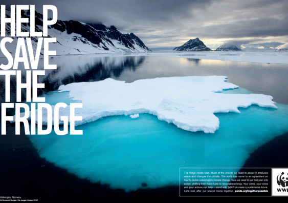
The use of images needs careful consideration too, as they can be interpreted in many ways. In some instances, images meant to be decorative can carry unintended meanings, which may also contribute to an erosion of trust.
Small changes, big impact
Colour choices in particular can inadvertently affect how messages are perceived.
In one study, a rich red was chosen for an important climate communication by the designer to represent both “warning” and “heat”.
This choice is supported by colour psychology theory and is a valid design strategy. But in this case, it actually influenced at least one viewer to perceive the message as “corporate science” – contributing to a complete loss of trust in what was otherwise a compelling message.
A slightly different approach can have a big impact.
If, instead of focusing on the subject or finding, graphic designers base their style decisions on communicating the endorsing institution, there is the potential to significantly improve trust in the message, as well in the domain of science itself.
Shifting the perceptual focus from individual scientists to the institutions behind them holds promise in rebuilding trust in science. Through strategic visual communication and a deeper understanding of public perceptions, it’s possible to foster a climate of trust in science that is conducive to addressing the changing global climate and other pressing challenges.
Dr Rebecca Green is a lecturer and researcher at UNSW Sydney’s School of Art & Design, with qualifications in graphic design and sociology. She has worked as a graphic designer for more than 20 years, moving to academia in 2012. Her experience extends from app design, websites, cartooning and interactive museum exhibitions to 2D and 3D animation, and a later move to sustainable design practice.
Originally published under Creative Commons by 360info™.


