We live in a world where information is arriving faster than we can process it. This is never more true than in a time of crisis. With the COVID-19 situation changing by the minute across the globe, how do we keep up with what’s current information and what’s not?
How do we find the truth when the misinformation and miscommunication—however well intentioned—is spreading faster than the virus itself?
If you Google COVID-19, there are already more than five million references, and more than two billion references of #coronavirus in the media. There are conspiracy theories, advice from different levels of government, conflicting medical advice, and opinions flooding in through traditional and social media, and those of us still talking at safe distance around the recently sanitised watercooler.
In the fight to contain the virus, graphic design might seem an unexpected weapon. But graphic design has a long history of helping identify, fight and stop the spread of disease, dating back as far as 1854 when another epidemiological disaster threatened the population—the London cholera outbreak.
Working hand-in-hand with medicine, graphic design—or data visualisation more specifically—changed the course of history. Florence Nightingale is known as the founder of modern nursing, and for improving sanitation in war hospitals. But she was also a pioneer in infographic design.
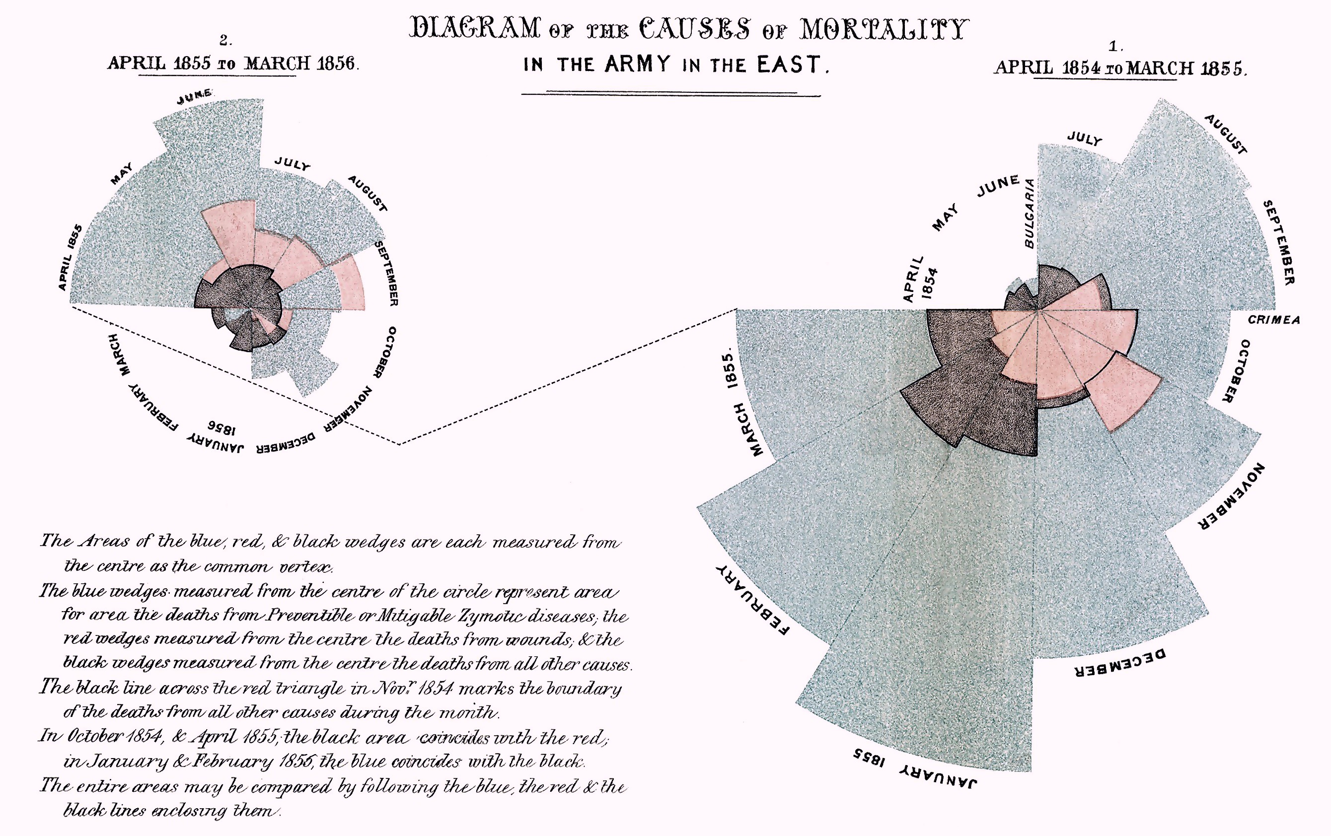
Publishing her report on war hospitals in 1858, Nightingale worried the statistics she had included seemed dull so she included an infographic that she invented.

Deaths from preventable disease are represented in blue, battle wounds in red, and black represents all other causes of death. It’s easy to see deaths from preventable disease far outweigh those from battle wounds once the soldiers arrived at the battlefields. This clearly showed that disease, rather than battle wounds, was the real threat, paving the way for critical change in hospital hygiene standards.
Four years earlier in 1854, Nightingale had helped care for some patients from a terrible cholera outbreak near Broad Street in central London. The cholera pandemic started some 10 years earlier, and killed 10,000 Londoners in 1854 alone. In just three days, 127 people died near Broad Street and people were fleeing.
At the time, medical opinion was that cholera was caused by miasma, or “bad air.” A physician John Snow suspected it might be contaminated water, but his ideas were roundly ignored by his colleagues.
He used another data visualisation, this time a location map, that clearly demonstrated clusters of cases as little dots around one specific water pump on Broad Street. Using the map, he convinced authorities to close the pump, and the outbreak quickly ended.
Snow’s work is considered a founding event of modern epidemiology, the branch of medicine driving our response to the COVID-19 pandemic. In both cases, an infographic was the tool that persuaded people and changed the world.
We are far more fluent in infographics today, although our understanding and trust in the data presented is often at much lower levels. We often judge the authority behind the infographic—and how trustworthy the data is—based on what the infographic looks like.
That is, its visual elements, such as colour, slickness of design, imagery, logo or representation of the authority producing it and so on. This aesthetic judgement can change viewer opinion regardless of what the message says, or who is saying it.
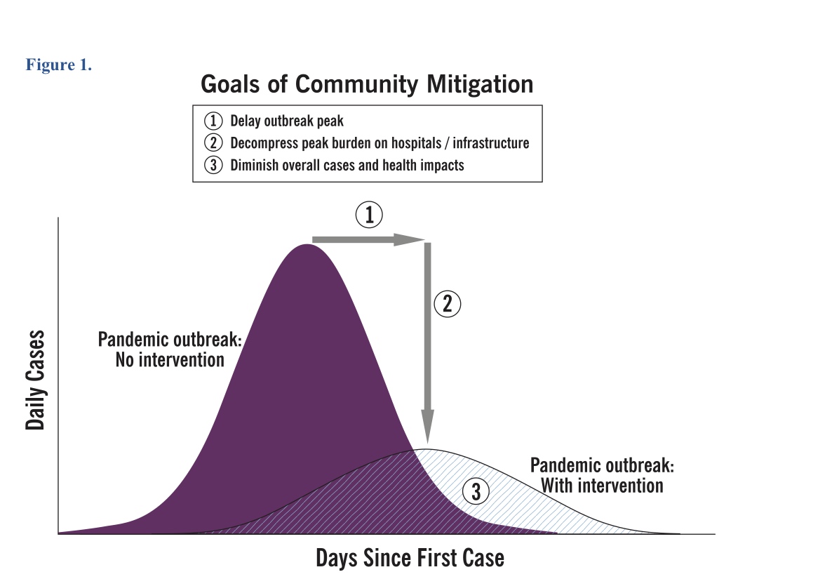
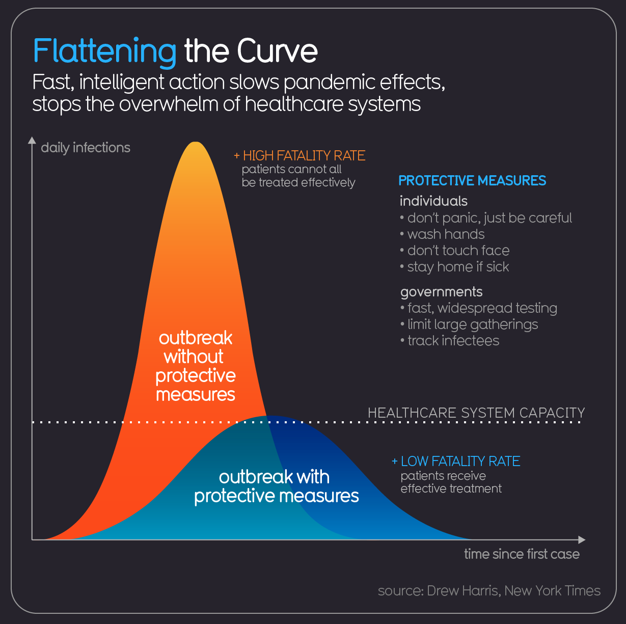
The infographic that has become the defining graphic for the COVID-19 pandemic, with its own hashtag, is the “Flatten the Curve” graph. Its earliest-known use is in a 2007 paper published by the US Center for Disease Control, previewing responses to a pandemic like COVID-19.

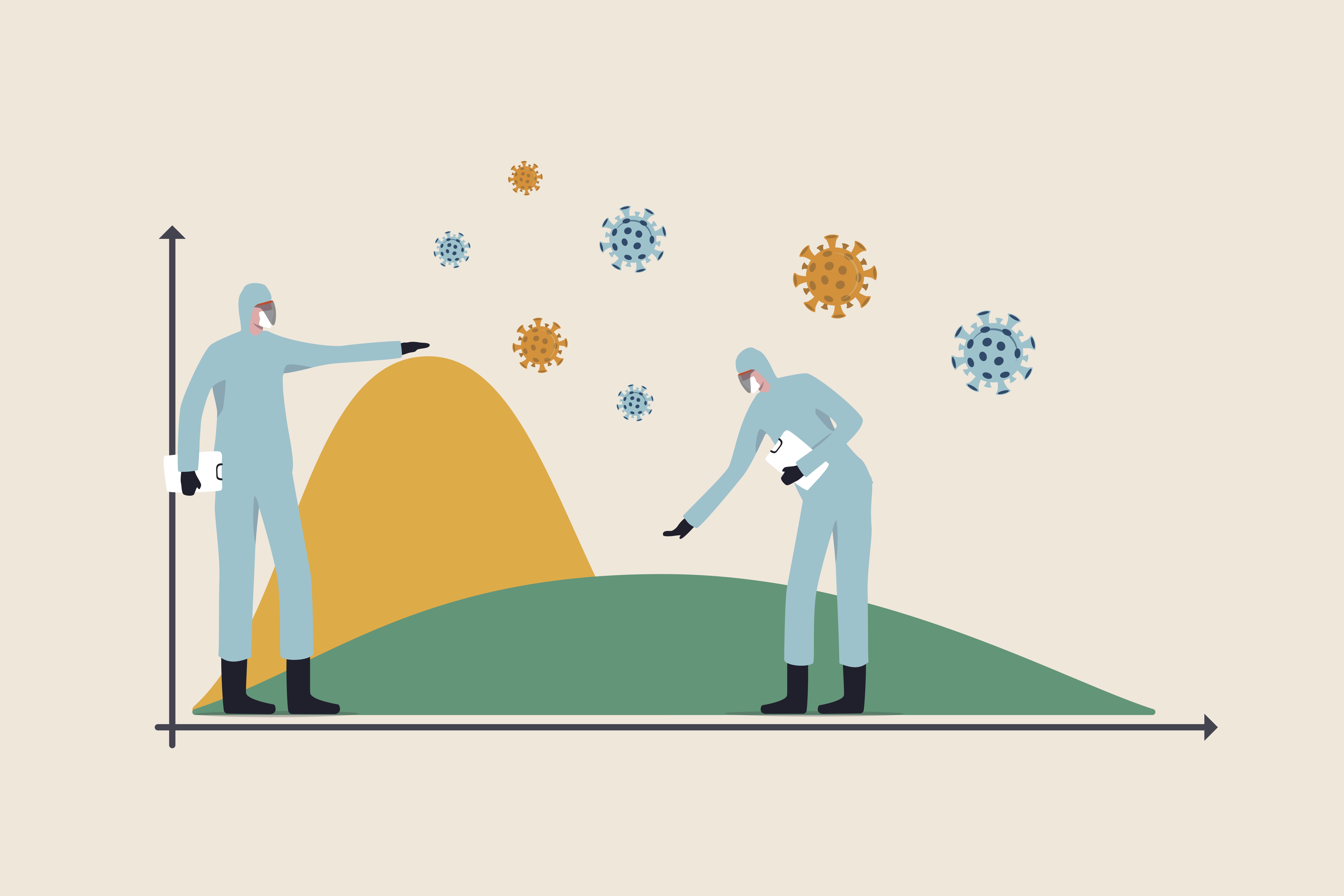
In one simple graph many messages are clear. The most important? That we must all unite in trying to limit the immediate impacts on our health system. We must all play our part to “flatten the curve.”
So why do we trust this graphic? We can use the techniques of rhetoric to isolate reasons it works.
First, it has been used by many authorities and commentators around the world as their driving message, so rhetorical “repetition” helps us remember it. Studies have shown that when we can remember something easily, we are likely to trust it more (this is known as ‘the Availability Heuristic’).
Secondly, when we can attach an infographic to people we trust (whoever that might be for each of us) then it develops its own authority. This is called Ethos, where the speaker’s own credibility in turn enhances the credibility of the message.
And thirdly, the graphic has been translated and reinterpreted so many times, but the simple key elements of the graph remain the same. The different curves always show that same, clear message.
This rhetorical approach has important implications for how our authorities deliver concepts to us. Repeating a message that is easy to understand, and attaching it to authority figures we trust might be a good start.
Dr Rebecca Green is a lecturer in UNSW Art & Design.

