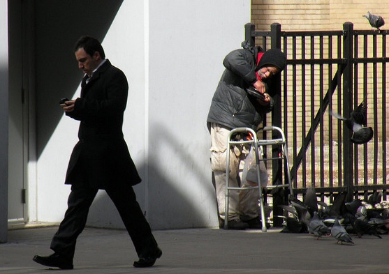
What did the rich man say to the poor man? Nothing, they never met. *

OPINION: As in many other countries, income inequality in Australia has grown over the past two decades. At the same time, Australia is one of the most urbanised countries in the world, with more than 60% of the population concentrated in just six major cities. Incomes in these cities are very spatially segregated, with high and low earners concentrated in different suburbs.

Do recent trends mean this joke is increasingly likely to be true?

In new research, I used census data to examine these patterns. Focusing on the incomes of men aged 25-54 in our six largest cities, I found that income inequality among men has grown substantially since 1991 – particularly during the 1990s.

This has been associated with increases in the relative income gaps between different areas within the cities. The share of inequality associated with location has also increased over time – an indicator of increasing segregation.

To the extent to which people draw on the resources of the people who live in their local area, this spatial segregation has potential implications for social cohesion and intergenerational inequality. There are also substantial differences across cities. Sydney was substantially more unequal than other cities over the whole period.

The census tells us the gap has widened

These results are based on detailed tabulations from the five censuses from 1991 to 2011. The focus on men aged 25-54 is partly for data availability reasons, but also permits a simpler focus on those income trends associated with wage growth and workforce-age income support payments.

The research examines how incomes vary across the local areas in our six largest cities. These areas are defined using the Australian Bureau of Statistics “statistical local areas” (SLAs) designation.

In Sydney and Melbourne, SLAs correspond closely to local government areas, while they are generally smaller areas in the other states. The income measure is the single census question on the person’s total income (before deducting taxes) – answered in categories.

Statistical interpolation techniques are used to generate a smooth income distribution and to compensate for a change in the payments of income support between 1991 and 1996. More details can be found here.

The graph below shows trends in city-wide inequality since 1991.


Figure 1: City-wide inequality. Author's calculations from ABS Census data

In each city, male income inequality grew substantially during the 1990s. It flattened out after 2001 (generally increasing slightly up to 2006, then falling back a little after the global financial crisis). In all years, incomes were substantially more unequal in Sydney than the other cities, with this gap widening over the period.

In part, this reflects the larger size of Sydney. However, Sydney is now only slightly larger than Melbourne. Most of the gap is likely due to the high wages in parts of the financial services industry centred in Sydney.

Within the sub-regions of each city, inequality also increased, following a similar pattern. However, the growth in income inequality within local areas was less than the overall growth in inequality. Corresponding to this, the gap between the average incomes in each region also increased.

This is indicated in the graph below, which shows a measure of between-region inequality – the extent to which the average incomes in each area differ. Using the “GE(1)” measure of inequality, this more than doubled between 1991 and 2001. It then increased slightly up to 2006 and fell back slightly after the GFC.


Figure 2: Between-SLA inequality. Author's calculations from ABS Census data

The overall combination of these trends is that the share of city-level inequality associated with location has grown over the period. For the GE(1) measure, this share increased from about 15% to 18%. That is, spatial segregation between rich and poor has increased over time.

Are we segregating ourselves?

One simpler way of describing the spatial concentration of incomes is to consider the situation of the top 10% of Sydney men – those with annual pre-tax incomes of $141,000 or more in 2011.

What fraction of these rich men lived in the low-income areas of Sydney? If we define low-income areas as the SLAs with the lowest average incomes and containing 20% of the male working-age population, then we find that only 5% of rich men lived in these areas in 2011.

So while it is true that some rich men live in the areas that have low average incomes (and maybe they might meet poor men), they are four times less likely to do so than the average man (5% vs 20%). And this segregation has increased over time. Back in 1991, 6.2% (rather than 5%) of rich men lived in these poor regions.

The other cities are also segregated, though not quite as much as Sydney. Looking at the top 10% of earners in each city in 2011, the percentage of these who were in poor local areas was 5.6% in Melbourne and Brisbane, 5.9% in Adelaide, and around 9% in Canberra and Perth.

Dark shades of inequality

This data also allows us to consider which areas are more segregated or mixed. This is mapped below for Sydney and Melbourne.


Figure 3a: Within-SLA inequality in Sydney. Author's calculations from ABS Census data


Figure 3b: Within-SLA inequality in Melbourne. Author's calculations from ABS Census data

The darker shades indicate local areas with more within-area inequality – though for small regions such as this, it is more appropriate to use a word with more positive connotations such as “heterogeneous” or just “mixed”. The more mixed areas are generally those with higher average incomes (plus some areas with high ethnic heterogeneity).

This is driven by the fact that most regions include at least some men with low incomes, but high-income men are unlikely to live in the more homogeneous outer suburbs.

The concentration of high-paying employment and the poor transport linkages of Australia’s major cities undoubtedly play a large part in driving this.

* Apologies to Toby Morris, who doesn’t think this is funny.

Bruce Bradbury, Associate Professor, Social Policy Research Centre, UNSW

This article was originally published on The Conversation. Read the original article.